Mariposas Spanish School
After seeing my work on the Hyde Park Montessori website, Yvette Montalvo of Mariposas Spanish School reached out to see if I would be interested in a website overhaul for their program on a WordPress platform. Without hesitation, I told her yes. I love the mission behind Mariposas and was excited to design a website that not only met their current needs but was fun and vibrant as well.
The first thing we tackled was updating their style guide for both branding and language use. Yvette was looking for a way to incorporate more Spanish in the website that wasn't intimidating for a monolingual parent looking for classes. This task was almost too perfect for us because I speak French, if I couldn't translate it, she didn't want it.
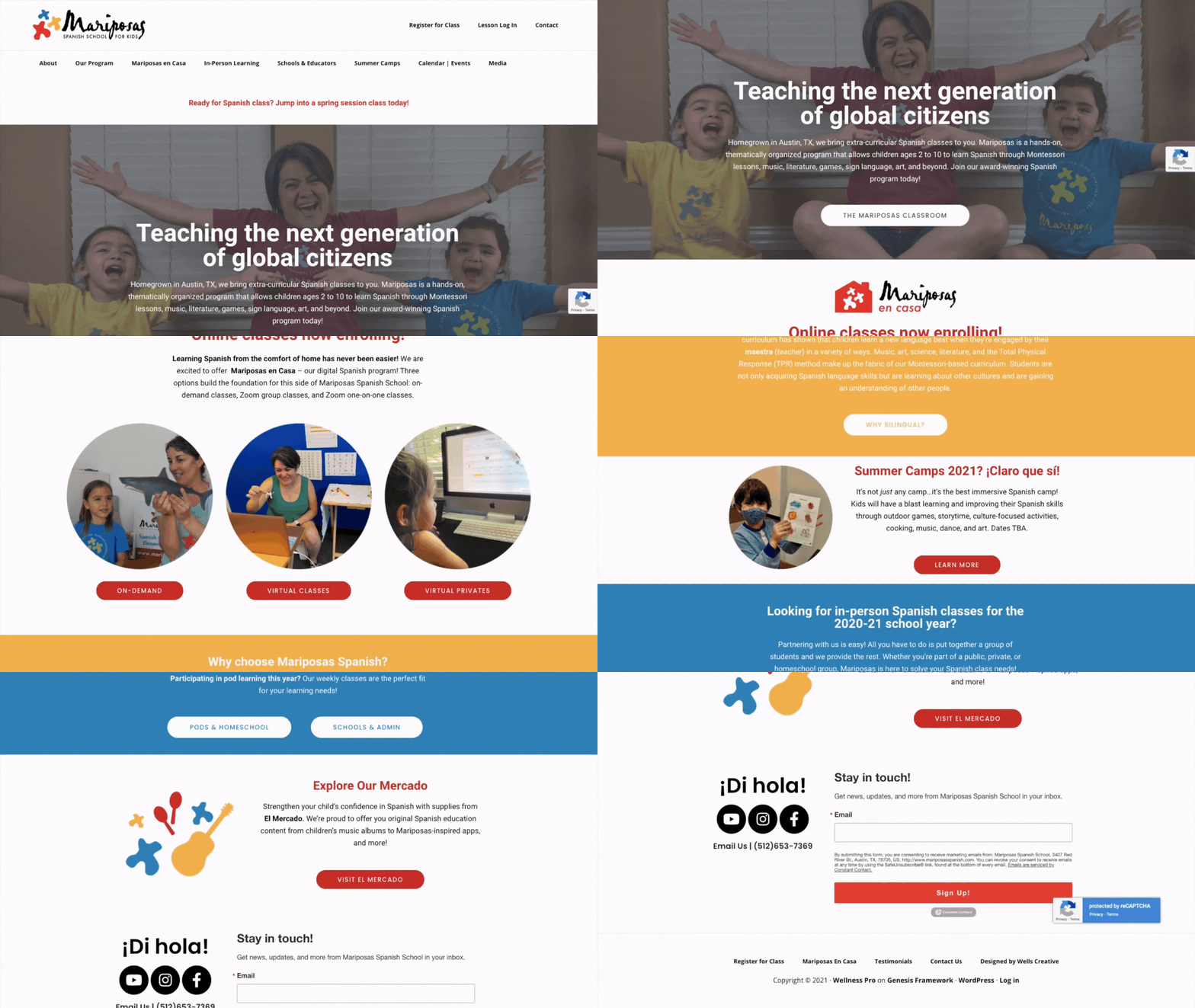
We decided to omit the pink and purple palette they had been using for the logo and original website. No major updates were made to the logo, but we did shift the mariposas icons to the left instead of above the text and switched them to a tricolor composition. This red, blue, yellow palette is not only used across the website but is now the main trio of colors for collateral and other content across the brand.
While this website was quite the undertaking due to the sheer amount of content from the last ten years, it was such a rich and rewarding process to see Yvette and her right-hand woman, Laura see their vision and ideas come to light. One of the aspects I'm most proud of is incorporating passive lead funnels across the website for different categories. Such a simple elevation has brought in a consistent flow of unexpected traffic.
“Homegrown in Austin, TX, we bring extra-curricular Spanish classes to you. Mariposas is a hands-on, thematically organized program that allows children ages 2 to 10 to learn Spanish through Montessori lessons, music, literature, games, sign language, art, and beyond. Join our award-winning Spanish program today!”
Hats worn: Web Design, Content Production, Copywriting, Brand Design.


